Rebranding an advertising icon
The Situation
People remember things that surprise them. Things they don’t expect. Things like, an agency with a name that sounds like a rare tropical fungal infection, for example.
WONGDOODY was founded in 1993, and has proved that the unexpected can do some remarkable things.
Now, it was time for their identity to reflect that.
The Solution
Having the privilege of working at Wongdoody, we experienced first hand who Wongdoody was. But we needed to step back and challenge those very same perceptions.
After decades of playing it safe, we wanted to embrace our vaguely naughty moniker with a new identity that was true to our ethos. Something simple, that demands attention and vibrates with energy. Just like the agency itself.
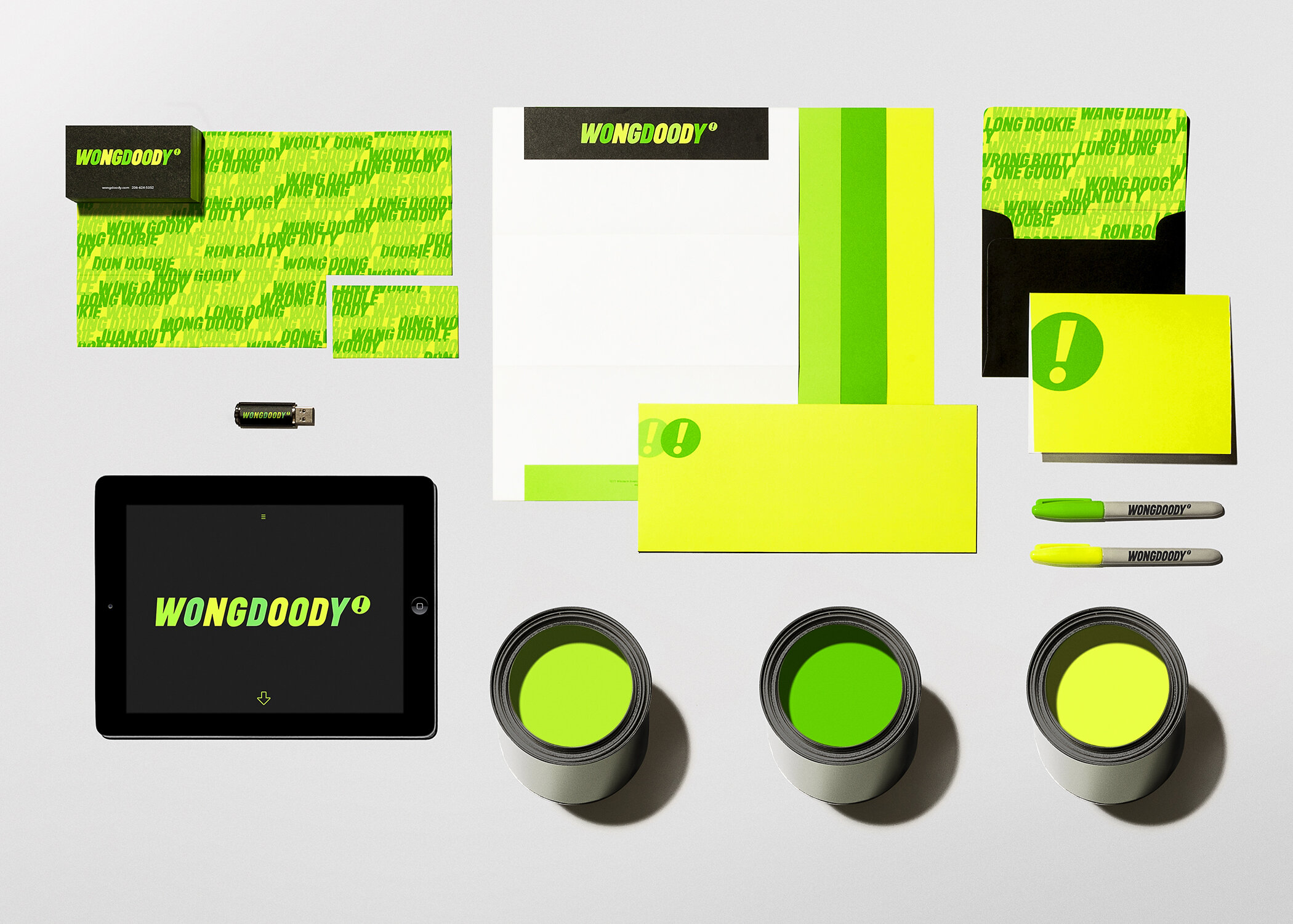
The logo is comprised of nine custom drawn letters—obliquely set in all caps, and punctuated with an exclamatory glyph we call the trademark of enthusiasm. Becoming the agency icon that trademarks the energy and boldness WONGDOODY has become known for.
Branding
Visual Identity
Typography
User Experience
Furniture Design
Custom Alphabet
Based on the letterforms of the logo, we created a custom display typeface that speaks with exclamation—achieved through a trifecta of bold, condensed and oblique characteristics.
The Identity
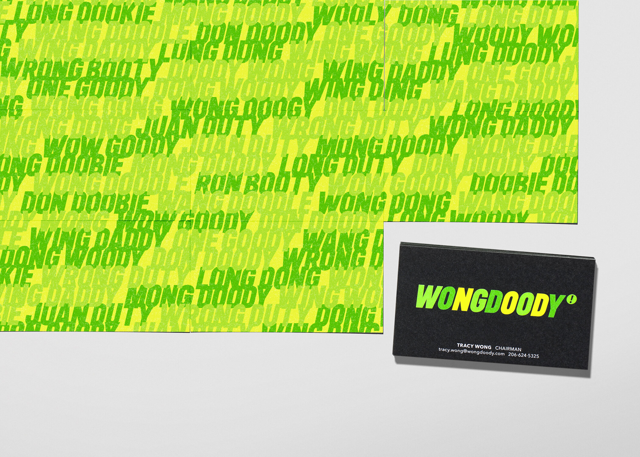
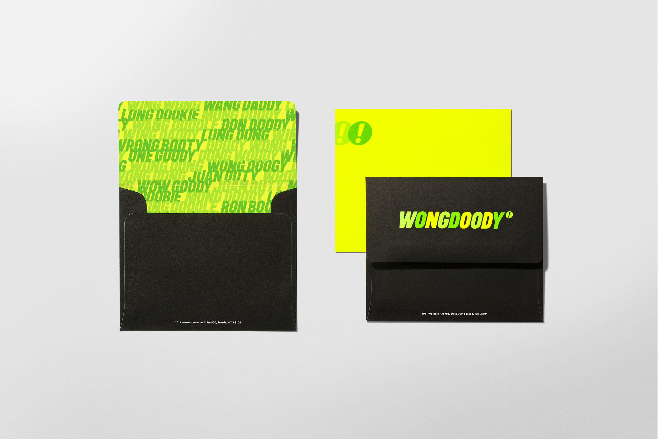
The identity also played on people's relationship with the unexpected nature of the agency name. People often mis-heard and mis-pronounced WONGDOODY, repeating back a mangled half-moniker. These mangles represent the thousands of carelessly typed letters, emails and ill-conceived recalls from over the years. We decided to celebrate the strangeness, sharing "psuedonyms" on the back of the business cards, hidden on the website and used in on-boarding kits for new employees..
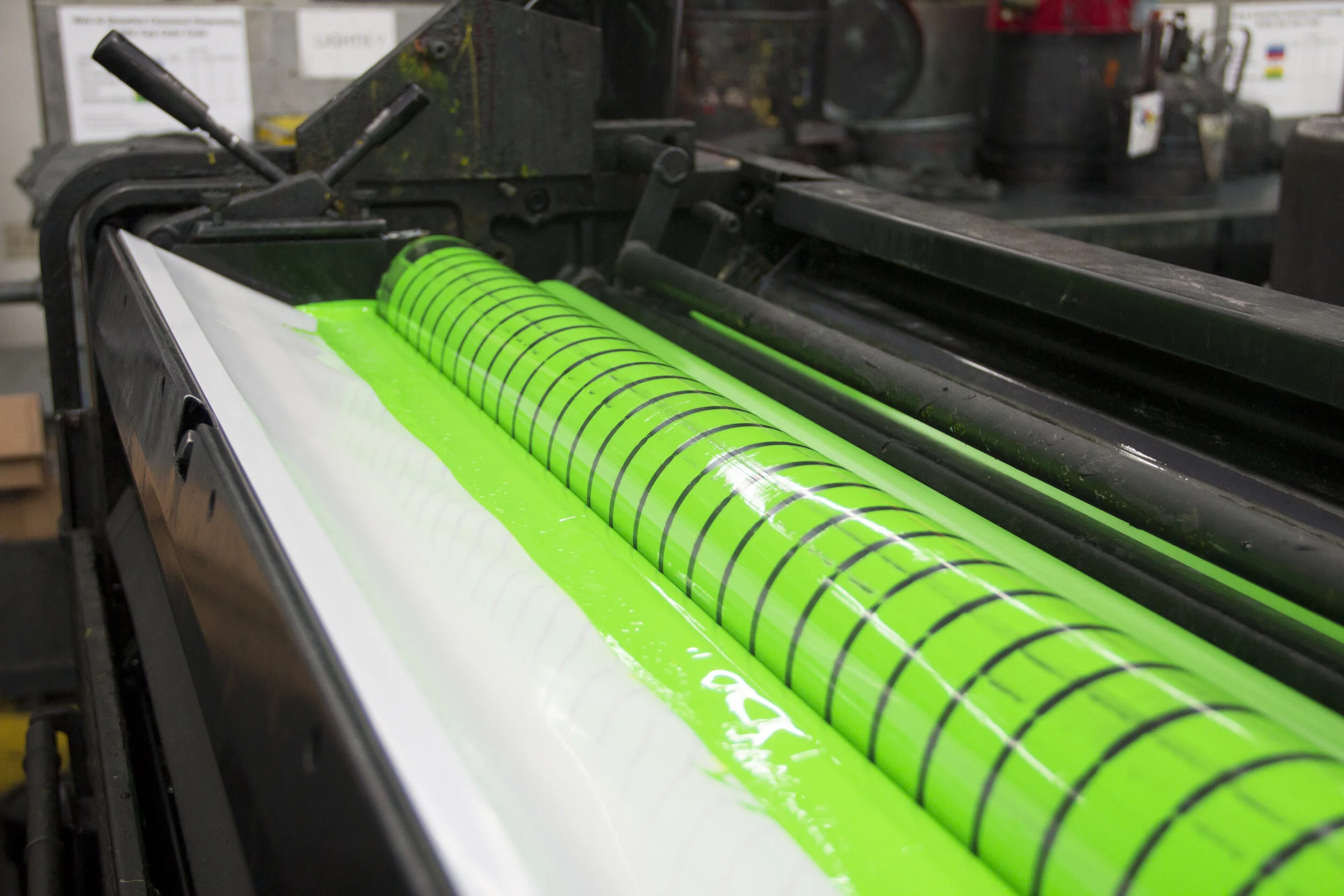
The green and black color palette has always been a part of the Wongdoody brand and is a nod to the founding partners’ cultural heritage. We wanted not only to keep it but play it up by intensifying it to a more energetic neon color range.
A bold landing
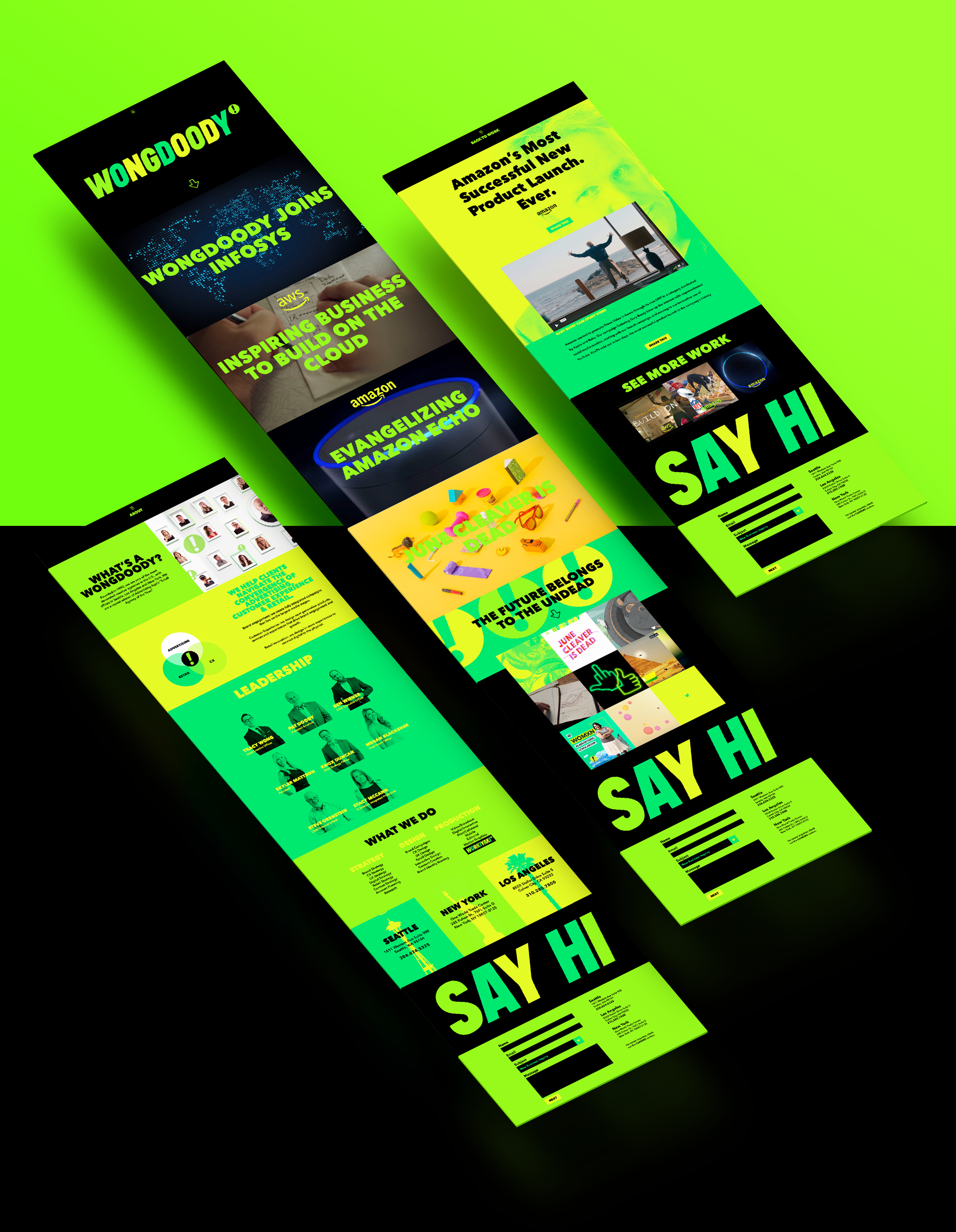
We wanted the site to be bold and responsive with a bit of the unexpected. A reflection of the agency itself. One part business, one part play. We displayed agency work full-screen and buried a special easter egg in the logo. Clicking the trademark of enthusiasm initiated a short video honoring our mangled-name history.
A bespoke on-boarding experience
We welcomed new employees with Wongdoody’s version of a new-hire kit. Contents included an array of mangled-named items all packed into a hot neon WONGFANNY. Every kit included an all-access invitation to the TOUR OF DOODY. A mobile app that gives employees a self-guided audio tour of the offices and their surrounding communities.


